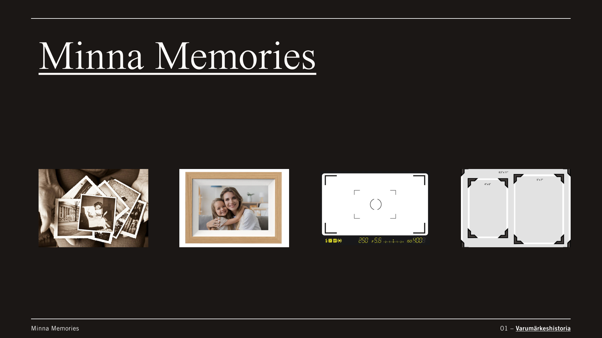
Background: Minna is a startup that provides high quality digitalization of physical photos and photo albums. They had a brand strategy and an identity, mission, and vision – but lacked a clear visual representation of them. The building blocks were there, so my mission was to evolve and expand them. This had to be completed and implemented before the launch, which was three months away.
Brief: Create a visual identity that can quickly be implemented and used.
Role: Art director & visual creative.
Delivery: Brand guidelines.
Research: I started by reading up on the brand, going through the purpose, mission, vision, values, and target audiences. This gave me a good understanding of what to keep in mind going forward – the brand personalities and target audiences being especially important.
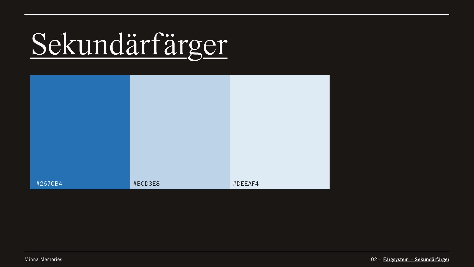
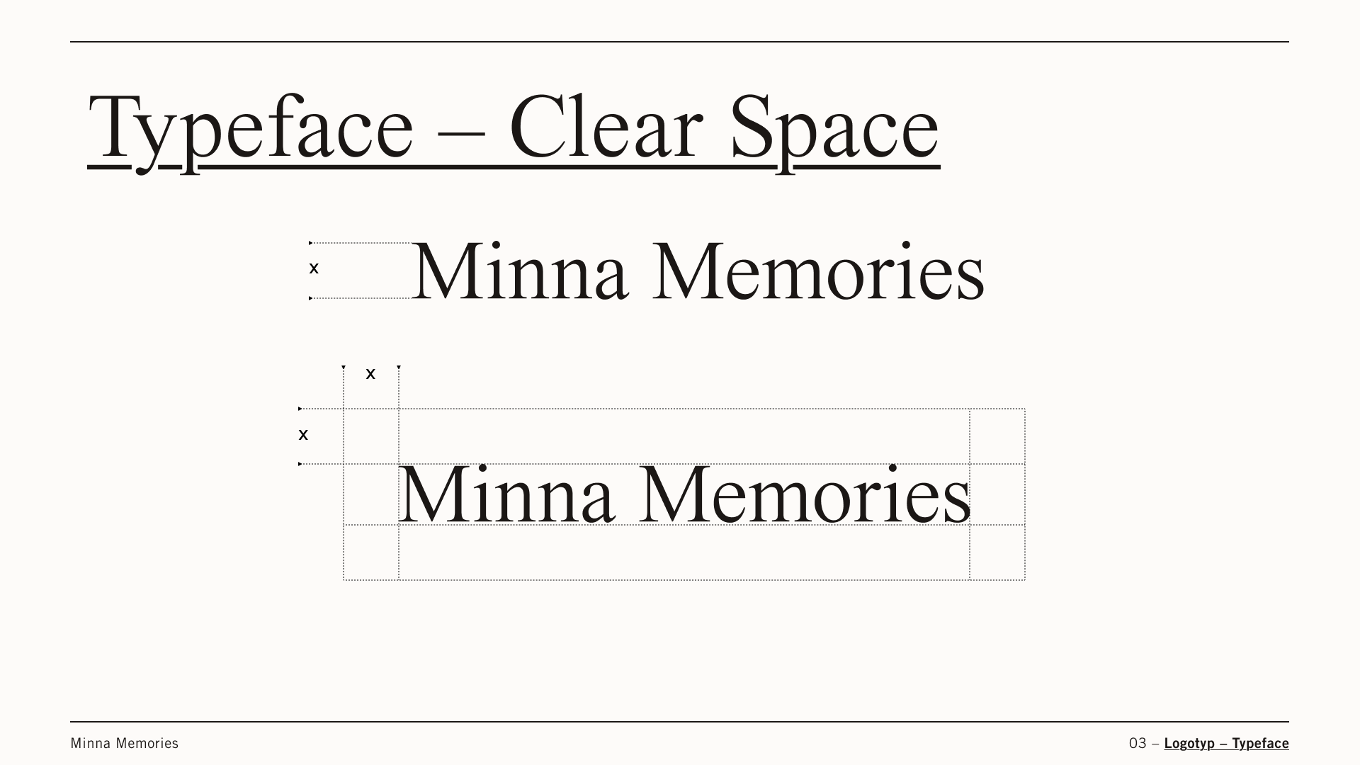
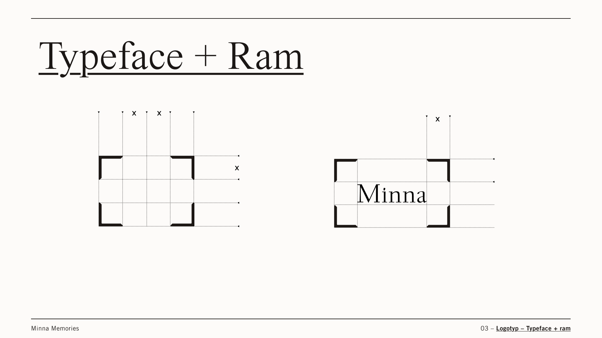
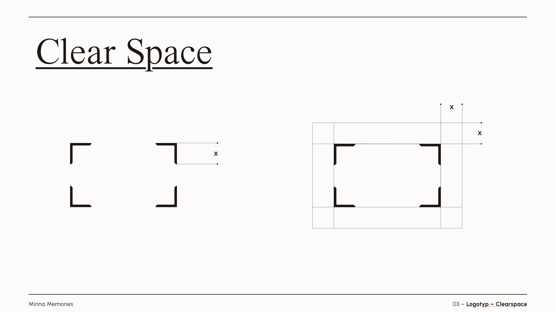
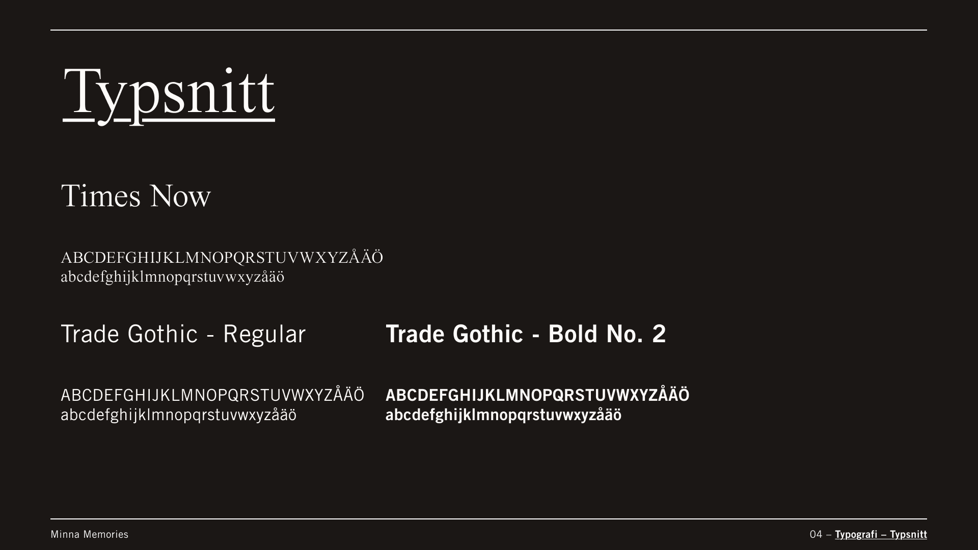
Then created a user journey through the website, checking it against the visual assets to see what were present, what was missing, and what could be improved. Minna had a logo, typography and a color, but they weren’t defined. They were building blocks that needed to be established so that they could built upon and used going forward. The insight from this was that brand guidelines were needed.


Work: I gathered inspiration and references to create mood boards for the visual identity. It was important to keep within the brand personalities that were present while also having the target audience in mind. With that being an elderly demographic – the difficulty was to find the right balance between making it visually appealing and also making it accessible.


I iterated and repeated the process, using the double diamond method. Drafts and mockups were created, and at each stage, sense-checked the results to ensure they aligned with the brand and functionality. Finally, we settled on a style that felt right.
Delivery: